Bay Of Fundy (PPG10-07) vs Sea Salt (HGSW3287) vs Castaway (PPG1129-3) vs Flora (N390-2)
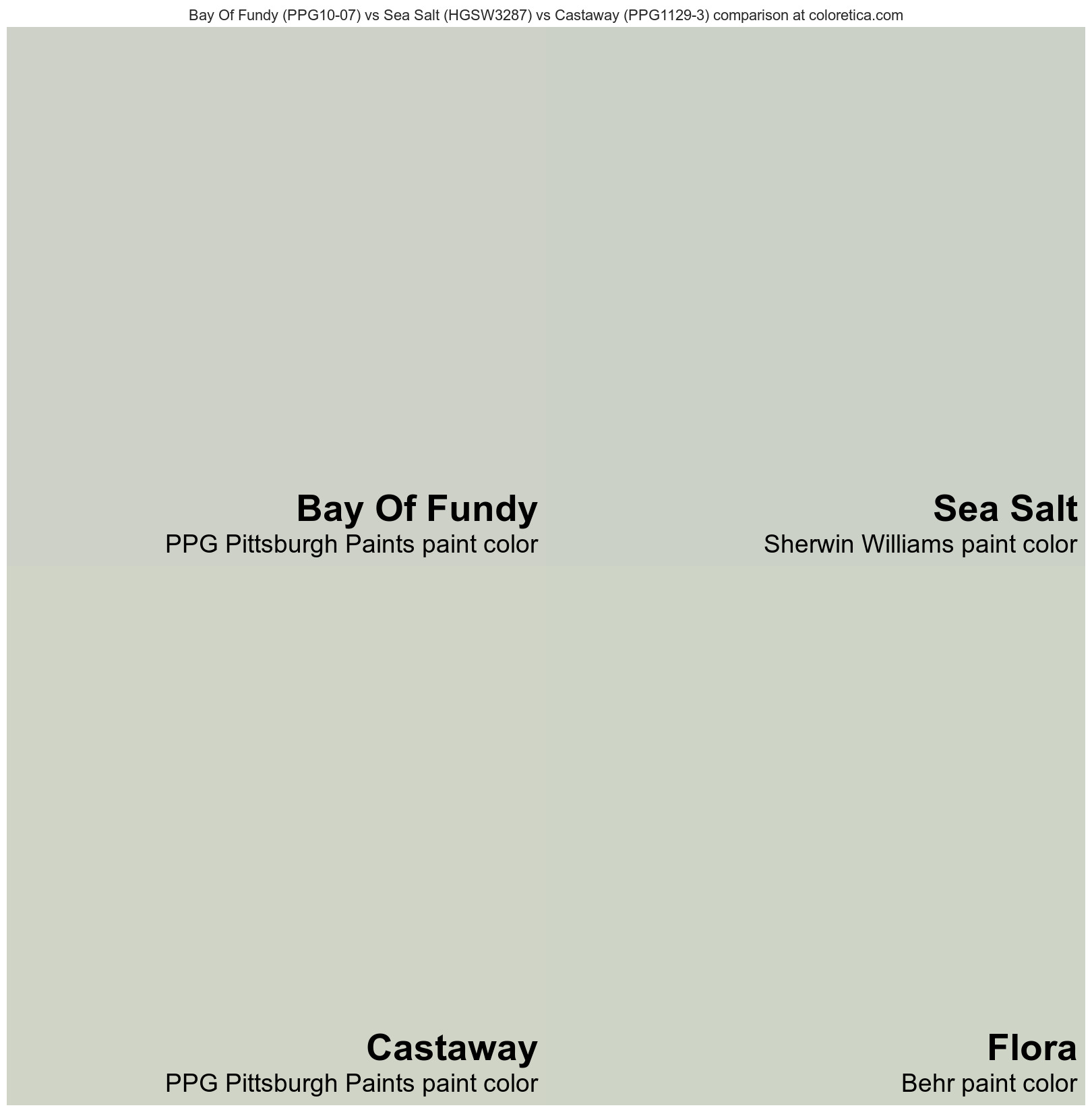
This color combination involves four colors depicted as follows: Bay Of Fundy - top left, Sea Salt - top right, Castaway - bottom left, Flora - bottom right. Comparing them side by side helps to contrast their similarities and differences. Combining four colors is also a simple way to create attractive color schemes. You can also lookup any of these colors individually on our site or refer to the summary tables for their key characteristics displayed below the image on this page. We made it easy for you to compare essential features between these different colors.
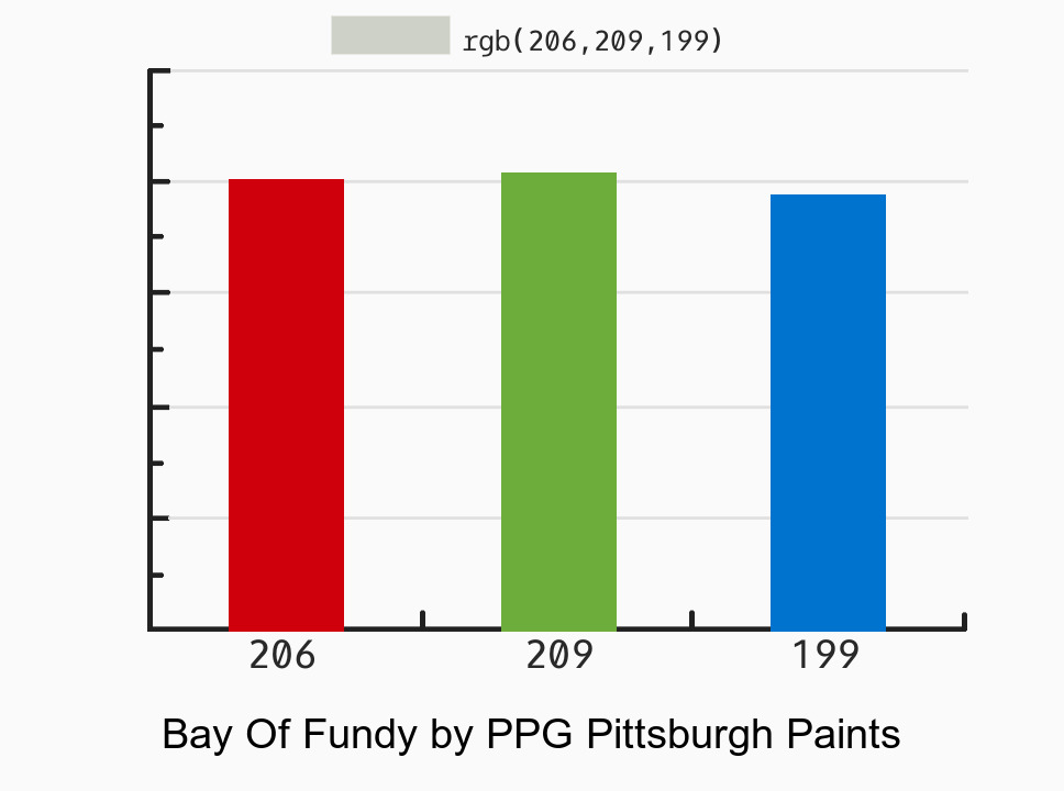
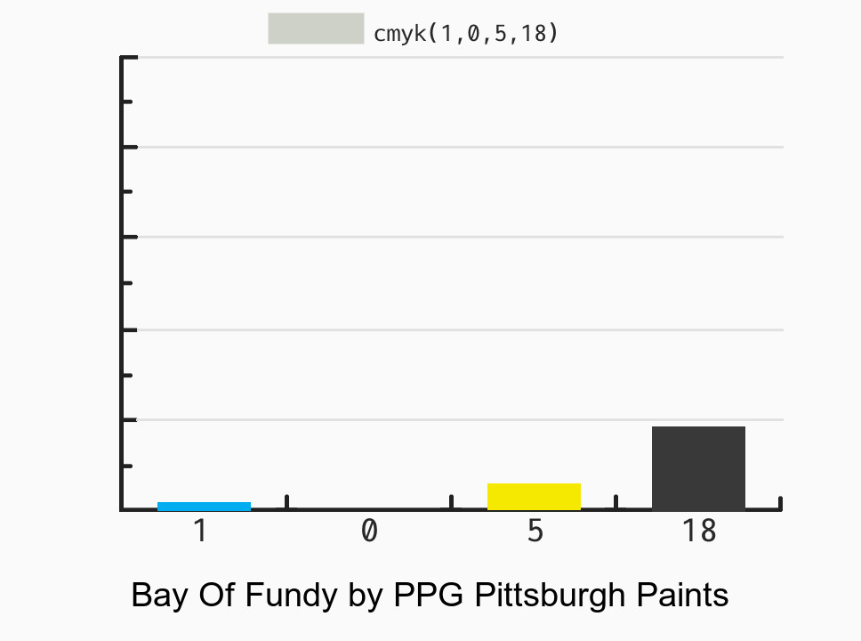
Bay Of Fundy (PPG10-07)
by PPG Pittsburgh Paints
| Color Brand: | PPG Pittsburgh Paints | ⋯ |
| Color Name: | Bay Of Fundy | ⋯ |
| Color Code: | PPG10-07 | ⋯ |
| HEX Code: | #CED1C7 | ⋯ |
| Color Family: | Yellow-green (warm) | ⋯ |
| RGB Decimal: | 206, 209, 199 | ⋯ |
| RGB Float: | 0.808, 0.82, 0.78 | ⋯ |
| CMYK Percentage: | 1, 0, 5, 18 | ⋯ |
| Color LRV: | 62.85% | ⋯ |
Castaway (PPG1129-3)
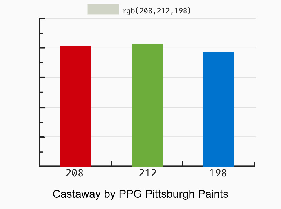
by PPG Pittsburgh Paints
| Color Brand: | PPG Pittsburgh Paints | ⋯ |
| Color Name: | Castaway | ⋯ |
| Color Code: | PPG1129-3 | ⋯ |
| HEX Code: | #D0D4C6 | ⋯ |
| Color Family: | Yellow-green (warm) | ⋯ |
| RGB Decimal: | 208, 212, 198 | ⋯ |
| RGB Float: | 0.816, 0.831, 0.776 | ⋯ |
| CMYK Percentage: | 2, 0, 7, 17 | ⋯ |
| Color LRV: | 64.57% | ⋯ |

Drag to change color sample order
Bay Of Fundy (PPG10-07)
Sea Salt (HGSW3287)
Castaway (PPG1129-3)
Flora (N390-2)
Remove from view
Bay Of Fundy (PPG10-07) | [ ✕ ] | |
Sea Salt (HGSW3287) | [ ✕ ] | |
Castaway (PPG1129-3) | [ ✕ ] | |
Flora (N390-2) | [ ✕ ] |
Sea Salt (HGSW3287)
by Sherwin Williams
| Color Brand: | Sherwin Williams | ⋯ |
| Color Name: | Sea Salt | ⋯ |
| Color Code: | HGSW3287 | ⋯ |
| HEX Code: | #CCD1C8 | ⋯ |
| Color Family: | Green (warm) | ⋯ |
| RGB Decimal: | 204, 209, 200 | ⋯ |
| RGB Float: | 0.8, 0.82, 0.784 | ⋯ |
| CMYK Percentage: | 2, 0, 4, 18 | ⋯ |
| Color LRV: | 62.61% | ⋯ |


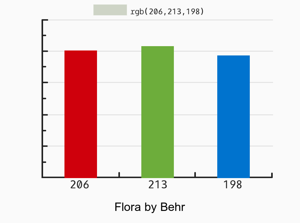
Flora (N390-2)
by Behr
| Color Brand: | Behr | ⋯ |
| Color Name: | Flora | ⋯ |
| Color Code: | N390-2 | ⋯ |
| HEX Code: | #CED5C6 | ⋯ |
| Color Family: | Green (warm) | ⋯ |
| RGB Decimal: | 206, 213, 198 | ⋯ |
| RGB Float: | 0.808, 0.835, 0.776 | ⋯ |
| CMYK Percentage: | 3, 0, 7, 16 | ⋯ |
| Color LRV: | 64.79% | ⋯ |

Color #1
Color #3
Color #2
Color #4
Four color comparison tool allows even more options and comparisons when choosing colors for a project or design. With four colors, you can see how they interact with each other and how they compare in terms of hue, shade, and tone. This can be particularly useful when trying to create a color scheme or palette that works well together. Additionally, a four color comparison tool can also be used to find a replacement or match for a color from a different brand or palette. Overall, having the option to compare four colors side-by-side can help ensure a cohesive and polished final result for your project.
This four color comparison tool allows you to evaluate how four different colors compare against each other. This is a great way to assess color properties, such as whether they are darker or lighter, colder or warmer, or have different undertones, which can significantly affect how they look when used together or individually. When selecting colors for a project or design, it’s essential to consider these subtle differences.
It’s important to note that these comparison tools are not perfect, and some digitized colors may not accurately represent their real-world counterparts. Nevertheless, they can still save you a lot of time and help you shortlist a variety of candidate samples from your local paint store.
Our side-by-side comparison feature aims to save you research time and assist you in making informed decisions. However, it’s crucial to keep in mind that colors may appear differently on your screen. We recommend verifying the color match in the final medium and lighting conditions before making a final decision.
